tutors feedback and getting it ready to print

I feel I am now ready to print the calendar. It has taken me some time to construct the calendar but I am happy with the layout and the balance between trend package and calendar. 


Before I go to the printers I feel it is important for me to show my tutors first to allow them to preview the product and give feedback on any elements I need to change. 


There has been a few parts of the outcome that they have suggested I change. 


Within the trend explanations there were a few sentences that needed rewording or certain spellings changed. This was not a big problem and I am very pleased that they were able to pick up on it for me.  On the third trend explanation it was suggested to revisit and look up the website 'notes on meta modernism' (http://www.metamodernism.com/). This way my trend would have a stronger meaning and look well researched. 


Whilst going through the pages and viewing the images, they mentioned a few issues with some of the images. 


The first image which they addressed was the one of Steph. They commented that it had been poorly edited as the skin was so airbrushed and looked patchy in places and the contouring of the cheekbone had been made to look 'muddy'. I agreed with what they were saying and decided that I would have to re touch the image. As I was going to address these issues I thought I may as well correct other parts of the image which I do not like. I do not like the way Magdalena has edited the hair. It has been blurred out at the edges and now looks highly edited. I want to create a more natural finish so I will also address this. I decided to use a blue wash over the image to link it back to the mood board. The mood board is very blue and I want to portray this in my image. 


This is what I have been able to achieve:


Magdalena's edit-                                          my edit-


I am pleased with the results and feel I have done a good job. I feel that this image demonstrates my Photoshop skills and ability to take advice from lecturers feedback. I am mostly impressed with the way I have corrected the hair. I feel it looks a lot neater and crisper, giving a more natural finish. 


They also asked if I would be able to revisit the image of Caroline and extend her neck slightly as it looks a little short. This was something I had not noticed but thought I would correct anyway. I have done it very slightly so it still looks natural. I was unsure on how to address this issue but after playing on Photoshop and carrying out trial and error way I feel I came up with a effective solution. 


Before-                                                            After-


Lastly they commented that they did not like the way the hair in the image of Elesha (image below) had been retouched. It looked highly unnatural and the the parting just disappeared into a blur. I totally agree with what they have picked up on and feel I need to correct this. Luckily I have the original file of this image so I can work on it to create a better finish. 


It has taken me some time but I am extremely happy with the results. I feel this image strongly shows my Photoshop skills and has improved the image. It is very satisfying knowing that I have managed to create a better finish on an image compared to someone who works in industry. it makes me more confident in knowing that I would be able to re-touch images to a high standard when working in industry. 


Before-                                                                After-


The lecturers were happy with the calendar and asked to see my blog. When pulling up the pages I mentioned that I really like the mood boards but they do not fit in the calendar. They strongly suggested that I do include them as it would add to the trend element of the calendar and back up each image. They thought it would be very important and as the quality of the mood boards was high it would help improve the project. I mentioned I would not know where to put them and they have now suggested that I feature them on the back of the page above. This also meant that I needed to re design my trend pages to fit in the mood board. It also changes the way the calendar can be hung up. The calendar is going to need to be whole punched at the bottom of the page in order for the calendar to be hung showing the image and the mood board. I intend to keep the option of a hooped ring bound so there is a choice of how the consumer wants to hang the calendar up. By hanging it up with the mood boards on show is going to double the space on the wall so I think having an option is important. 


This now means that the cost of each calendar is going to be increased as there is now nearly double the amount of pages but I feel it is important to do this to improve the outcome. 


After making the amendments and reconstructing the calendar I have returned to show them the work. 


They are pleased with the results and feel the mood boards do benefit and link in with the images. The only image which was slightly weaker when linking to the mood board was the image of Meg. They commented that there was no green within the image like in the mood board. Maybe address the image as the mood board is so strong. Other than this they felt everything was okay to print. This was very satisfying, knowing that I had their approval. I feel I have communicated with the lecturers well throughout the project and shown that I am responsible for independent learning. 


I have now got back in contact with the printers I intend to use and sent over a test file to ensure that the file is going to be able to open on their computers. As I am going to be travelling back from Southampton to Birmingham, I cannot afford to get there and the file not work, so I felt this was very important to do. I also checked that they are going to be able to print in the time slot that I need and they confirmed. I feel that I have shown my initiative and shown responsibility for my independent learning when contacting and trying out the file as it proves I am thinking ahead and showing ways of avoiding a problem. 


Thursday 18th April: I have still not had a conformation email from the printers clarifying that they have received my file and been able to open it.  So I have decided to ring them and check. Whilst on the phone I asked what to do with the bleed on the pages and they explained how to do it, very helpful! They told me they had received the email and that the file did open fine. I was confident with them and that they would be able to do what I wanted as they knew what they were talking about. 


laying out the calendar

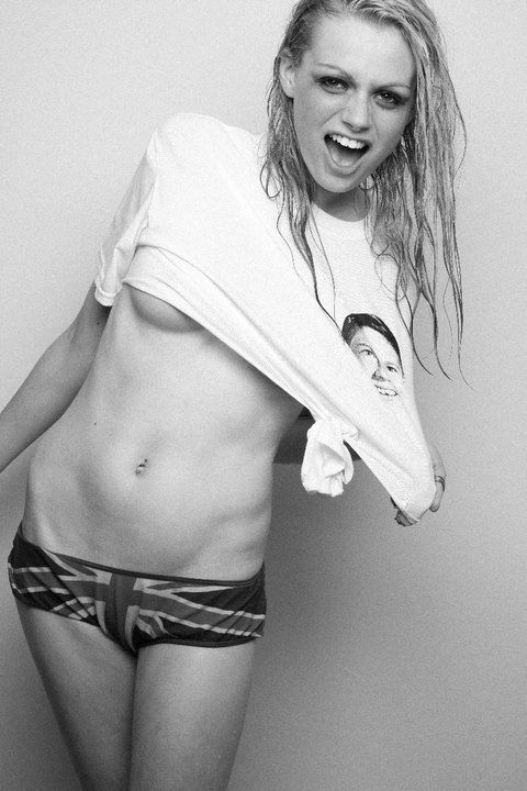
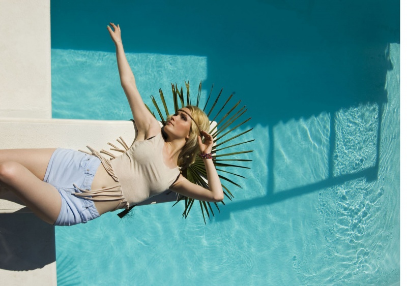
I now need to decide on the final images which are going to be used within the calendar. Luckily I only have mainly two images for each to choose from. I have also been adding to a document of what order and which images look better next to one another, so I have an idea of which ones I am going to use.


I have realised that my calendar is going to need a front cover and I am wanting to put an image from one of my shoots on the front of it. I need to pick one of the strongest as it will give an idea to the consumer of what is going to be featured inside the calendar.


I need to get an idea of what layout I am going to use first.


Due to a recent visit to the printers I intend to use I have decided to change the layout of the calendar.


I visited the printers to get a quote on how much it would be to print the calendar and also get an idea of what their print quality was and whether they would be able to achieve what I was after.


I was happy with the quote of what they gave me
(£25.00 for an A4 calendar printed on silk card and consisting of 20 pages)
and the quality of their printing. They had an enormous printer that filled the whole of their back wall. Seeing this gave me the impression that they would be able to achieve high quality printing.


They showed me an example calendar in A4 of what they had done. After flicking though I realised that A4 is going to be too small for what I want. If I am going to use A4 it would mean that the images I have created would only be around A5 which to me is too small.
The printers were in the process of an order which was printing pages that were square. This has given me the idea to print my calendar square as that way it would mean I get to print my images A4 and there would not be masses of room spare for the calendar aspect. I do not want the calendar feature on the page to detract or over power the main point of the calendar, the images.


I am not sure how I want to layout the calendar I just know of the content that will be within it. I have decided against using an inspirational column as I do not want to detract from the image. I want the calendar to be simplistic and clean cut so it is important to not have too much on a page.


After research online I have realised that I am going to be unable to get hold of the important fashion dates and be able to use them in my calendar. As the calendar is going to be for 2014 there are no definite dates released yet. This is really disappointing as I really think it would have added to the fashion and trend aspect of the calendar. As the calendar is targeting the fashion concious these dates would have interested them.


One of the most difficult aspects of designing the layout is finding a balance between a trend product and a wall calendar. I do not want the outcome to look like just a calendar. It is more than that. I also do not want the outcome to look like a load of pages of trends. Deciding what goes into the outcome and how it will sit on the page is going to be difficult. I want to create a specialist calendar. A trend forecasting calendar. It is very rare for the public to get hold of trend products so it is important that it is going to appeal but they are also going to use it, unlike a magazine where they will read the magazine and chuck it. I want the outcome to be related to constantly and by creating a calendar it will ensure that the consumer is looking and the product constantly if not daily. By ensuring it is a calendar as well will ensure that it is important in their lives.


I have looked around and these are some examples of layouts of calendars that I like


This is a very basic layout of a calendar and although it does not feature a image what drew me to it was the fact that it had a notes section. I had not considered doing this. The consumer could make notes and jot down ideas of make up and hair ideas which have been referenced from each months image. 


Although this is from a page where the calendar is daily rather than monthly. I liked the idea of featureing the date (or month in my case) at the bottom of the page. I also like the idea of the background of the image also being the background of the page. This way the image will look part of the page. I am not too sure how I would achieve this if I was to do it for my calendar. 


I like the way that the image is the main part of the page and the calendar, although featured is attached onto the side. It is also semi transparent so not to disrupt the the image. I like the idea of having the calendar aspect down the side of the page. I could use it next to my image rather than underneath otherwise it would be a very long calendar.


Although this calendar features three images and I only want to use one I like the idea of having the calendar tucked up in the corner. I also like the layout of the page. The way the writing is a clear feature and the year is down the side. I originally wanted to use a landscape format but with all of my images being portrait it makes the rest of the page a wasted space.  


This is another style which I like the look of. The image is portrait and by having the month down the side of the page allows the other calendar side to look so big.


This is a calendar page which is all about the image. The month is very small and hardly takes over the page. I think the calendar should be a little more relevant than this in my project. Although I am trying to find a balance, I still want the consumer to constantly refer to the images. This type of calendar is more of a poster that would be hung on the wall rather than a useful time keeper. 


There is the idea of having a different layout of calendar. I think the grid is a good idea as the consumer will still be able to write their plans on, but it is quite bulky and would take up quite a lot of room. 


I selected this image fir deciding on how to layout my front cover. I really like the way the image is the   entire background and the writing works over the top. It is simple with the colours all working together. I think that all of the calendar pages need to be consistent in style and colour throughout. Whatever is on the front page would have to work with all of the other pages. 


Although this is a diary I like the idea of creating something different. I have contemplated creating a diary instead of a calendar but as I have based my entire project around creating a calendar I think it is a bit late to change. 


I selected this image for the layout but I am unsure about it. I like the way the image is clear and big at the top op the page, and the month is written at the top. But I am unsure about the grid, I do not think it fits in with the rest of the page, maybe if the calendar was in a blue it would work better. 


Again, this image was selected for when I would design the from cover of my calendar. I really like the layout of this page. I think the square aspect is different and does not look as basic. I also like the way the writing is over the top of the background but it does not interfere with the design.  


This would be for the back page, where the consumer views all of the months together. I like the idea of putting them all together so the consumer can get a preview of what they would be buying. 


I really like this image. The way the face fills the page and the writing states what it is but is minimalist.


This is a similar image to what has already been evaluated. I feel this style would be fitting with my calendars look however I am unsure whether it could sit over the top of the image as it may hide some of the head shot detail. It may need to be next to the image instead. 


This layout is very simple and clear cut which I like. Although there is a grid it is very minimalist and the focus is still upon the image. I think that the white creates a simplistic, clean cut appearance. 


I definitely like the idea of using a square layout. I also like the idea of fitting the writing around the detail of the image. 


Although it is in black, this calendar is very simple in style. The writing states simply who it is and what it is for. 


I really like this layout and even the wording. I would like to use the wording 'A year in Beauty'. The image background is also the background for the rest of the page which is something which I like. 


Although this calendar is in black and white and this is something which I do not want. I have decided on using the square page layout and continuing the image background of the image into the background of the entire page. I think it is important to have the year on the front cover so it clearly states what year it is for. 


This is a different layout which I had not considered. The calendar is featured but it is very minimalist. I really like this idea as the calendar is just another feature to the image. By using this layout, the consumer would be unable to use it as a time keeper which is something which I feel is important in making it relevant to the consumer. 


This is a similar style to the previous, just in a portrait layout. 


This image was also selected for the front cover. I like the font of this image as it is quite edgy and modern. I also like the way the image continues off the page so it simple. 


This front cover is very different to what I had been previously looking at. I like the way the name is clearly stated at the top and the purpose is at the bottom but I am unsure of the white border, it is so simple it looks a little boring. 


This was the last image I selected for my front cover. I like the idea of having the writing on one side of the page and the image on the other. But they still work together as they sit on top of one another. The purpose being at the top and the year being at the bottom is a common theme which runs through many layouts. I feel this is something which I should draw upon. 


I have come up with a few ideas on how to layout my calendar. 


I like this layout because the consumer can still use the pages to write on and keep a daily planner. I feel it is not too intrusive over the pages but has a nice balance between trend and calendar aspects. 

I do like the simplicity of this image and although it features the calendar I feel there is a lot of wasted space. As the consumer cannot use the calendar for anything more than seeing what day and not being able to reference it for plans, I do not think the calendar feature is strong enough. 
This is the first layout I came up with for my trend pages. It is in keeping with the rest of the calendar as it is very simple. I think it may be a little too simple and not exciting enough for the consumer to want to read it. 
 I decided to play around with the layout and see what else I could create. I like this design as it feels more welcoming to read. I also like the different font that has been used as it adds variation and some personality to the calendar. I have also put key elements in the hair and makeup within the key colours. Although this is a good idea it does not show up that well on the lighter colours. I have been able to create these looks as I now feel confident in Photoshop and InDesign. 


I came up with this idea when finding this from Loreal. This inspired me to create this design.


I have decided to use the grey instead of the white as I found the white looked too stark and simple. I want the calendar to be modern and minimalist, but not boring. The images looked like they had been slapped on the page and there was no thought gone into it. 


Before deciding on a final layout I ensured that I got some feedback. They mentioned to think about whether the ring binder would destroy the top of my images. This was something which I had not contemplated. It was important for when it is bound that it would not go through the images. I could either make the images smaller which would create more space at the side. There is already a lot of space I do not want to create more. Or I could make the canvas size a little bigger to make room for where it will be pierced. I have decided to add a centimetre allowance at the top of my pages to allow the ring bind to go through that instead of my images. 


When thinking about the ring bind I had to then decide on the type and style of ring bind. To keep it in keeping with the modern minimalistic look I think that I should use a silver metal bind. I also need to ensure that the calendar is going to be able to be hung on the wall, so ideally the ring bind needs to have a hoop in which the consumer can then put a pin through and attach it to their wall. 


I think this layout meets the criteria of what I want to create. It is clean cut and has a focus upon the images. The calendar needs to be specific to my trends so I feel that I have been able to find a balance between the two aspects. It is important to create this so the consumer feels like they are purchasing something unique and appealing. As there are no other calendars like this that I am aware of it is a desirable product which brings them closer to what is going on in the fashion industry. The planning and decisions that are made when constructing and creating a trend package is normally very private, especially in fashion. Consumers usually find out weeks down the line, normally from secondary sources. This calendar will challenge this and provide the consumer with primary information which they can get immediately for when the season arrives.

shoot 8 and 9

When I turned up for the shoot with Lulu I was the first to arrive. The studio which Lulu had booked was still being occupied by the people who had booked it before so I had to wait until they were finished. They did leave the lighting out that I thought I might need. I started to set up and found I had given myself plenty of time. 


When the model turned up I showed her through what I was wanting to achieve from the shoot and then got started with the hair and make- up. Whilst I was styling Elle, Lulu arrived and started to set up the studio to what I needed. She was really helpful and said she would create whatever style I wanted which was a huge relief and good to know that the images were going to turn out how I wanted them. 


The make up application seemed to go really quickly and found I had plenty of time to shoot. After spending 45 minutes shooting Lulu was happy with the images she had captured and showed me them to see whether I was too. I was and just as I was removing the make-up from Elle my other model arrived. Whilst I finished off removing the make up I got Lydia to get changed into her strapless top. 


Whilst I carried out the make up and hair on Lydia, Lulu went for some lunch and returned to re-jig the lighting a bit later. 


I had originally planned to use hair extensions within Lydia's hair to make the hair really big on top of her head and to make it appear like there was chains lost and tangled in her hair. But after applying the hair extensions I decided it looked better without. The hair was not a complete colour match and there was too much hair. 


The shoot with Lydia also went extremely well and I got a range of different images.


At the end of the shoot I offered to let Lulu put all of the images on my laptop and then I could go home and have a look through and decide on two. She preferred to get the whole shoot over and done with so decided that she would sit with me and we could edit the images together, that way I could get the edits straight away and I could have a better input into how they were going to be done. It also meant that she was only willing to give me the two images but I did not mind as I only really needed one but I would like two to put in my portfolio. I agreed to sit with her until we were done. I thought this was an very good idea and wished I had of had that option when working with Magdalena. I preferred working with Lulu as she was willing to carry the shoot out how I wanted. 


Lulu was also incredibly talented on Photoshop and if I mentioned something on the image to change she could easily do it. When we were done I felt very satisfied and pleased with the results. I wish I had found her earlier in the project and asked for her to do more. I mentioned that I may have to re shoot an image next week and she said she would be happy to work on it with me as she was impressed with my model scouting and make up and hair skills. This was reassuring, I now need to find a model for May's look. 


These are the images I received:


 We decided that it would be best to have one front on image and one to the side as an alternative. I am very pleased with the results and although we put a green tone over the image. When I got home and compared them to the other images within the calendar, it was too intense so I have re edited them and toned the green down. 
I feel that the hair and  eyebrows are the focus within this design and it has worked well. I feel I have managed to achieve the grungy look but also relate it back to my mood board and trend. The model I used was brilliant at taking direction and this resulted in getting images which are really strong and intense in emotion. The only issue I have with the image which was also a problem when creating the design, was that the paint in the hair would not dry because it was oil paint. This meant that orange paint kept on being transferred onto the skin so I had to keep stepping into the shot to wipe away orange on the skin. As the hair was wet this also meant that the hair would not dry in place and I had to rearrange the hair into position several times. 

I feel that this image clearly reflects with what is going on in the mood board. The cemetery relates to the deep intense eyes and the fire is reflected in the strands of fiery hair. 

I felt like I had plenty of time to create this look so I was totally satisfied with the design and outcome.  I think I prefer the image where Elle is facing straight on as it looks like there is more attitude and arrogance. 

Budget: model fee £35.00


I am also extremely pleased with these images. They are really clean cut and I like the shape of the shoulders in relation to the background. The lighting is also extremely flattering. I think the smudged orange lip is extremely successful and could easily be related back to my trend of 'failure is the new perfection'. I think the orange lip could highlight to the consumer that orange and coral lips are in for this season. I also like the subtle aqua flick of eye liner. It is bright but it does not detract from the main element of the design, the lips. I feel that by the hair being styled up it has added to the clean cut image. I am very satisfied and feel this is one of the strongest images in the entire calendar. I am please d that I was able to reuse some of the jewellery which has been bought for other shoots and never used. Although the design is very messy it has been done in a carefully refined and planned way creating a striking image which would be something which could be seen in a magazine. There is nothing about these images which I would change. 


Lulu has been able to create exactly what I had envisioned and this is why these two images are my favourite out of the entire calendar. As most of the images I have used in the calendar are side shots, it is a nice alternative to feature some front on poses. I feel that by them being more head on they are more confrontational which is relevant to my trend.


budget:
model fee: £70.00


This was a images which was created from the shoot but for Lulu's portfolio. She has allowed me to have a copy to put in my portfolio. 


Fridays shoot: Friday was a pleasant change to what I had been doing the last few weeks. As it was for fashion students the focus was upon the clothing so the make-up did not need to be so elaborate. I had to do two looks on Caroline, the first was with golds so although gold was featured in my second trend, it did not relate to my mood board. The second look they were wanting was a lot more natural, in washes of pale colours as this was a more floral look. As they said to me I could create what I wanted within reason, I decided to cater it to the look I was wanting to create for May. I had to filter it down slightly but as May was a very natural look anyway this did not matter. At the end of the shoot they offered me the chance to get a few head shots so I could use the images. I jumped at the chance to tweak the make-up and cater it to what I needed. I added the bubble wrap around her neck and re powdered her face. I gave instruction as to what I was wanting and this is what was achieved. 


They gave me all the images at the end of the shoot which meant that I would have to edit the images myself but I did not mind this as it was my last image of the calendar. This is what I created.


As I was having to edit the images myself I only edited the one. I carefully picked which image was this best and this is what I decided on. Although the model is looking directly into the camera, the expression is very relaxed and soft. I used bubble wrap as it shows a nurtured and delicate feeling, like the model is fragile. The makeup is very subtle but it is in the same colours and depth as the mood board I created. I am much more satisfied with this image and am happy to use it within my calendar. The only element which I am not so pleased with, is the hair. I feel I could have done a better job at creating a tumbling up-do. 

I was unsure as to whether the shoot would be suitable to my look but it was and I feel it went very well. As I was organised and left myself plenty of time I feel that this has shown through the images and pays off. 

As this was not my shoot it did not cost me anything. 

This is the most natural and likely to be seen on the high street I think it will appeal to the target market. It is clear that they would be able to achieve this look and are more likely to attempt it. 


By doing a look like this it shows some variation in the images and my skills. It also shows my initiative to seize the opportunity to shoot with a model ideal for my look and use it to my benefit. 


I have put to use skills which have been learnt from when Alex Box did a demonstration at the University. I watched her show a more unique way of flattening eyebrows. This has been put to use in this image and I feel it was successful. I feel I carried out the shoot in a professional manner and allowed the client to get the outcome they were after as well as meeting mine. I feel that it is important to allow the client to be happy when working on a shoot in industry as that way you are more likely to be asked to return for work on future shoots. 

planning shoot for last two looks

For the last two images and the re-shooting image, I need to find a new photographer. As Magdalena was so good at photography my standards are high to find another one. They also need to have a similar style to what has already been shot. I do not want to ask around or even do the images myself. Even though I have learnt a lot from the photography sessions over the past three years I would prefer to use someone who specialises in photography and knows exactly what they are doing and if I showed them an image they would know how to recreate it. I decided to look back at Model Mayhem and see who was working in the Southampton area during Easter. I have found one photographer who's work I really like and she looks to focus upon fashion and beauty. She is also a fashion photography student at the same university as me making it extremely useful for her knowing the studios. I am a little wary about using another student as I know from past experience that they are not always as good as those in industry. When mentioning it to a friend she recommended to use this photographer and said her work is amazing but she is very busy and you may not get the chance to shoot with her. I decided to ask anyway. 


After a few emails back and forth the photographer (Lulu Mcardle) confirmed that she would be happy to work with me as it sounds an interesting concept. She also mentioned that she would be able to shoot next week and if I was free I could use the slot she had booked in the studio on Thursday. I have accepted and now got the challenge of finding models. As Lulu has booked a long session in the studio I am going to and do the two looks as well as re shooting the other look. 


These are some of Lulu's images which she has up on Model Mayhem. I really like her style as all of her images are very clean cut and she seems to know what lighting works best. 


My biggest task now is to find models, during the Easter holidays, local, within budget and during the day. I have always tried to aim to shoot of an evening as models are usually more likely to be available. As I only had 3 looks to do and each one had a model specification I know it is going to be a challenge. Luckily I have a week to scout them and I feel a lot more confident in being able to carry it out.


Tuesday 27th March: By Sunday (25th March) evening I had managed to find myself a model for my re-shoot. She was found through Model Mayhem and lives not far away. I had confirmed with her and given her all the details for the shoot on Thursday. I contacted her again yesterday through email and had no reply and I have contacted her again today and still heard nothing. I am presuming that she has changed her mind. I do not want to use a model who is going to be unreliable so I have decided to continue my search for finding a model to re-shoot the May look. 


I have however managed to source models for the last two looks of my third trend. The first is Elle Richie. 


As Elle's hair is a ginger/reddy tone it would work well within my trend. I feel her look would match the grungy look I am going for with the orange eyebrows and smoky eyes. I have decided to use her as I have been looking through her images on Model Mayhem and smoky eyes have been used a lot and she pulls it off. I think because she has quite a 'pretty' face with small features, a grungy look would work well as a contrast. She is also a full time model so feel confident that she would be able to achieve the look I am after. I have been emailing her back and forth and found out she is trying to build her beauty portfolio so is happy to work on a TFP basis as long as her travel is covered. As she lives not too far away I am happy to do this. 


The other model which I have managed to find is called Lydia Taylor. I had been in contact with her prior to this shoot and have been wanting to work with her for ages but each others diaries have always clashed. She is also quite expensive and wants £70 for her time and travel. She has a really strong face with defined cheekbones and a strong jaw. She would be ideal for my September looks as she also has blonde hair. Although she is on ModelMayhem she is part of a modelling agency so she had to be careful with accepting the shoot. As we were communicating we came to the agreement that she would do the shoot as long as I would notify her if the images were to be published and that I would not put them online. 


Wednesday 28th March: I have been unable to find a model to re-shoot my May look so I am going to have to leave it for Thursday and think about booking another studio for the following week. 


I have also been asked to do a photo shoot with some fashion students on Friday. They have not informed me of what look they are wanting me to create but the model they have shown me who they are using would be ideal for my May look. They have booked the studio all day so I am hoping that if there is some time left at the end of the day I will be able to do the look I need. 


This is the model they would be using: Her name is Caroline Raymond. 


She would be ideal for the May look as she is blonde and has very small soft features. The look I want to create is going to be a lot more natural compared to what I did before so I need the model to have good skin and fair features.