trend 2 research

I have struggled to come up with a second trend that would follow on well from my previous 'Shattered Diffusion' trend.


I didn't know where to look at first and where to start.


I know that each trend is going to be different in the year but they can link slightly. I also know that from researching into previous trends the S/S' season's that they have a similar pattern. So I decided to look into what may be the next common theme.This is explained in the following blog entry. 


I looked into a different city, Birmingham and saw a few things that inspired me. As it was my home town it was easy to visit and I knew where to look. First of all was the impressive Selfridge's building, this could be viewed as a work of art or a monstrosity.


I like the unusualness of the architecture. It is structured with the rows of dishes but also soft at the same time, there are no hard edges and everything is soft, round and smooth. I like this idea for my next trend. It is a contrast to the harsh shatter effect of my previous trend but also links into the fact that the shatter has an epicentre and branches out in a circle effect. I want to draw upon circles for my trend as they appear in every aspect of life. The Selfridge's was a strong starting point to inspire me to look further into circles.


I decided to write down a list of things that had circles within them which I thought was interesting.


  • The Olympics - I knew that this was going to be an important event to the UK this year and could influence the way fashion and design could go. The Olympic rings are made up of five circles interlocking and represent how countries unite and come together for something important. I wanted to draw upon this 'all is one' theory and use it within my designs. 


  • I looked  into architecture- As the Bullring first inspired me I decided to look further into British architecture and see where it would take me. I found lots of structures that also took a rounded shape. These are just a few that I drew upon from just Birmingham. 
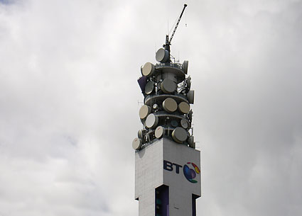
This is the BT Tower the tallest building within the city. Coincidently it has a top made of lots of circles.  Although they are lined in rows they vary in shapes, sizes and colour showing a sporadic pattern. 

This is the Rotunda, a building right in the centre of the city, a building full of apartments fit for a true shopper who likes to be in the middle of everything that is happening around them. This is a new iconic building to Birmingham, a building that fits in with the rounded theme. 
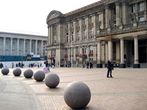
Although the purpose of the image is the Council House which is very grand, the solid concrete balls laid in a row in front of the building caught my eye. The idea that although spheres do not have an edge, they can still be put in rows to create one. 

I then went to look into other British architecture that was iconic and also rounded in shape. 
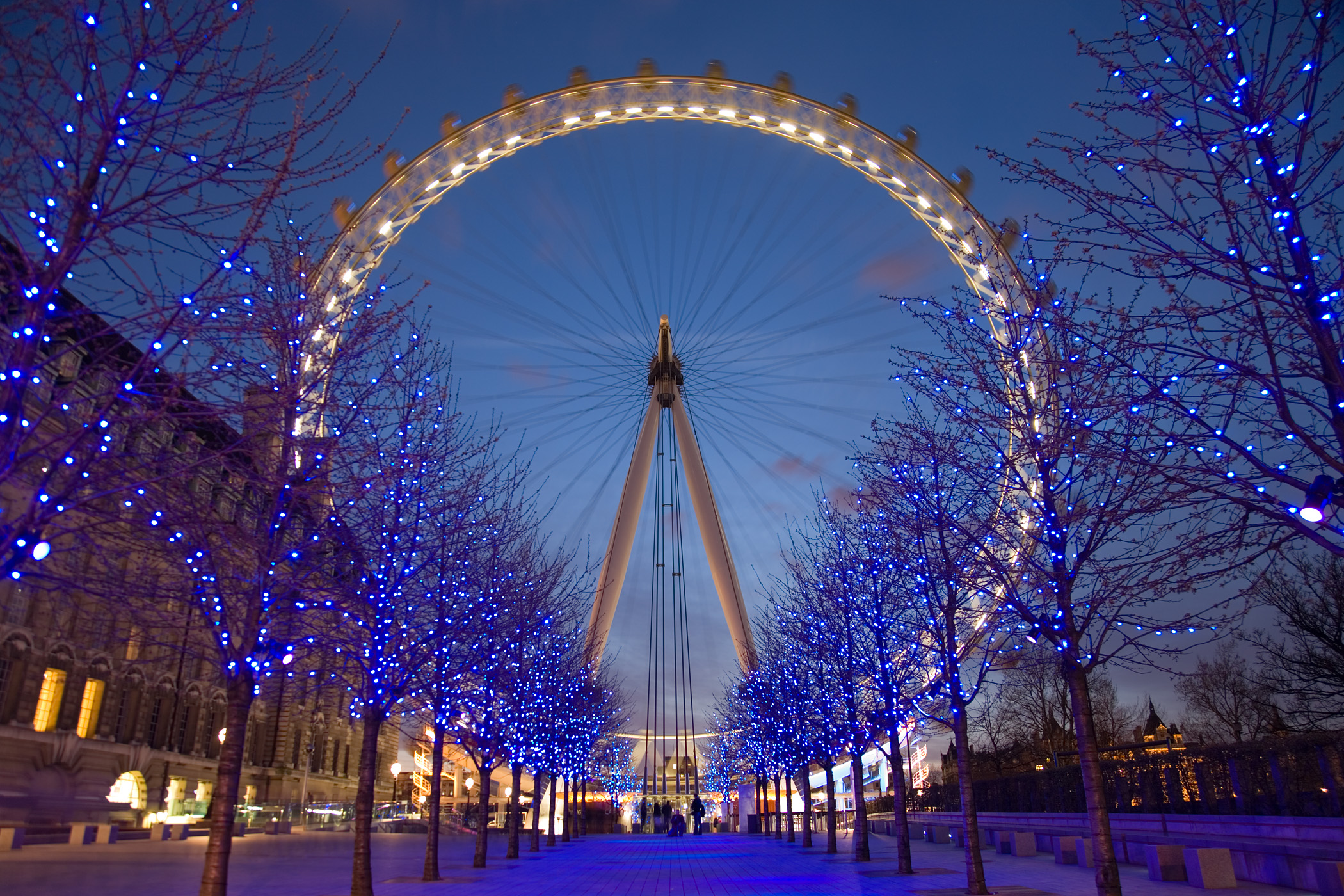
The obvious London Eye, a perfect circle which is recognised globally. 

As I was looking back at London I decided to re-evaluate what I had already seen and taken photographs of. I did notice a common rounded theme running through my images.
 Although there is no solid circles, when looking at this image of London I was attracted to the sunlight bubbles that have been captured in a row on the photograph. I like the semi transparent look and way that there is still something going on underneath.


From here I wanted to look into natural patterns, patterns in nature and patterns formed randomly. 


 This then lead me to look at a book called 'Walking in Circles' by Richard Long.


His book shows his journey across the world. He creates and documents shapes in particular circles that appear in nature and that he has created using natural products. The book documents his journey, his thoughts and sights along the way. These are just a few of the images from the book.


page 90
 Although this is not a photograph, it is a mind map of everything he saw whilst in Scotland. I like the simplicity of the mind map but still forming a shape to create an interesting way of reading a piece of text.


page 135
This is another way Richard has arranged words to assemble a circle of his sights and story of his walk whilst on a 8 day walk in the Hexie mountains. It is more of an interactive and interesting way of reading something which I will consider when arranging my text for my trend explaination.


page 70
page 124

This is a piece of art created due to a journey. He has used mud to create this rounded piece but it is made up of many smaller imprints.


page 111
This is a photograph of somewhere in Mexico where Richard visited. I like the way that altough there is a clear circle which has been formed it still fits in with the rest of the surroundings. I want my designs to show the theme but not detract from the natural beauty of the face.


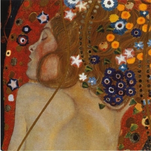
I also looked into the artist Gustav Klimt. The ideas in my head reminded me of some of his artwork which has circles within them. Some of his images feature beautiful women wrapped up in the background. They all look very relaxed and feminine looking giving off a very soft feel, something that I want to portray in my images. Here are a few which I particually like 
Water Serpents II
Acqua Mossa
The Kiss
Adele Bloch-Bauer II (1912)


They are all very romantic images with the women often looking like they are in love. I like this idea of having a loved theme to create a softer look. The circles and shapes that surround the women are detailed but do not over power her, she remains the main focus. The colours in the images are also rich but not too bright. They are not pastels but not intense shades. The images are very busy, I like some elements to the images but as a whole this would be too much for an image for my calendar. There is so much going on that you can study the images for a long time, I want one striking feature to my images.


COLOUR
Colour wise I wanted to reflect a lighter mood for Spring/Summer. Circles have no edges just a constant line which could go on and on. To me this creates a softer feeling which I think can be shown through colour.
The colour pallette that was seen in this image spurred me to select the colours I think work well with the trend. I particuarly like the blues, pinks, nudes and purples.


I also like the background colours of this image. They are all very soft and blend into one another. They are subtle with just hints of colour peering through. Again I like the way that there is still something shining through underneath.


I feel I now have a strong basis of research to now lead me on to creating my second trend forecast. Having such a strong first trend feels like I have now set the bar extremely high in creating further ones. I understand how to create them but I have found it more challenging to create. I believe this is because I have been lacking in my imaginative and inspiration skills. It was important to me to reference points from the UK as this is where I will be targeting my outcome. In order for the consumer to understand and relate to the trends I felt it was important for me to keep the focus on Britain. By me carrying out thorough research it not only allows me to put together a strong trend forecast but also evidence my investigation skills, proving that I have addressed the learning outcome ' Devise innovative and appropriate solutions to a specific styling problem or brief'.


S/S 2012 research

In order for me to get a better idea of what trends may be about for the future I feel I need to review what is going on now in the beauty S/S season. From there I can then see what has already been done and will not be about and also what I think will progress into a trend.


Makeup trends for S/S 2012 according to Harper's Bizaar.com


"Makeup artists played with a mix of old and new for spring. Backstage inspiration boards featured rouge lip colours that seemed pulled from a vanity table drawer from long ago, futuristic glittery eye accents, timeless natural tones and indelible smoky shadows and liners done in fresh ways. The overall message: pair vintage with modern to make a statement that’s unique and all your own this season."


Lips are either in classic reds or a romantic rose shade, lips either have a dramatic edge or a turn to soft modernity.


I think reds have been seen quite a lot in the past couple of seasons so I do not think it will make another recurrence for S/S 2014. On the other hand I believe that pinks and softer shades on the lips could and it is something I would be interested in bringing into my trend.


Big brows are also been seen a lot on the catwalks for S/S 12, again I think big brows have been used quite a lot. I do think they are going to stay around for a luttle longer as people are seeking for bigger brows but I believe there will be another twist to this whether it will be perfectly groomed, brushed up or untamed. 

Skin has a flawless natural feel to it this season with a pale radiance. There are no sight of tans at the moment as skin is only just starting to be shown after a cold winter and it looks like it is going to stay that way. The pale beauty is starting to become more important in today's society, people are realising sun=skin damage and people do not want this so I believe pale will be sticking around in time for S/S 2014. 

If a glow is wanted to be applied to the skin, the way forward is through bronzer and blush. These cheeks are an important element to S/S 12. 

Glamorous lashes are also appearing often within the catwalks for S/S 12. Femininity is back and this is a great way to show it. I think femininity is here to stay for a few seasons especially for spring. 

Cat eyes and eye liner flicks are in at the moment but I think the time is nearly over for this look. Fresh faced and youthful is something I want to interpret for my trend. The flicks have been a way of reminiscing on the Amy Winehouse look but I think it is time to move on approach something different. 

Colour washes on the eyes are being brought into the beauty trends and this is something I like the look of. These are some of the looks being used on the catwalks.


Hair trends of Spring Summer 

"In a season defined by minimalism and natural beauty, hairstylists channeled easy elegance for spring. The sporting life was a popular theme with styles that looked fresh from the ocean or outdoors, and classic American glamour had a big moment with polished ponytails, graceful braids, and bouncy blowouts. Still, nothing was too perfect or impeccable—deconstructed waves and undone knots and twists proved that having a bit of an edge is as chic as ever"


Wet, barely-wrung hair:

The ever popular ponytail:

The beachy wave has given way to the urban bend—a loose, louche curve in the hair that’s effortless

Embellished Updos:


Sophisticated Braids and Twists
Although these trends are around at present some will progress and adapt into similar but differerent trends. I want to draw upon these trends and use some of them to come up with ideas for my S/S 14 trend. I have noticed that as a trend the looks are more feminine and slightly softer for the S/S months. This is something I will continue to do for my trend. I do not want to simply copy the looks as they have already been done, instead I will use them as inspiration. 

Re-shooting january look

I knew I needed to reshoot the January look as I wanted to create a striking look for the start of the calendar. I knew that when looking through a calendar the consumer instantly gets an impression from the first few images they see. In order for them to be attracted to purchasing the calendar it needs to feature beautiful, attractive images as well as fully support a trend which is likely to take place in the future. I feel that by me addressing the issue of needing to re-shoot it shows that I am taking accountability for the outcomes and addressing several of the learning outcomes. 


I also wanted to ensure that the images were strong enough to showcase my skills and meet the higher learning outcomes. I was aware that because the January look was unsuccessful I needed to thoroughly plan a new look and ideally find a new model. 


I spent the week planning the new revised look. 


The make up in the originial look was not strong enough and did not relate to my moodboard well enough. I also wanted to use a different model that would be able to convey the dark theme of the trend. I used the class time available to shoot to get this look as I would be able to get help from two lecturers to ensure I was going to get the right look.


I changed the makeup design to be a lot simpler but darker with black eyes and the rest of the makeup very minimal. I really liked the idea of the hair blowing in the wind so I decided to stick to this idea as it relates to the diffusion part of the trend. I decided to base it upon this image. I like the strength of the model but it is still feminine with the sheer material and soft blowing hair. I wanted the model to show confidence as well as a slight air of femininity in her facial expression and pose. 
This was the image that I was able to recreate.


 I really like the way this image turned out. It did need some retouching that I had to do myself so it was very time-consuming but I think the result is sucessful. I love the way there is real depth to the image with the texture of the material blowing across and the darkness of the eye makeup against the smooth pale skin. One issue that I do have with the image are the eyes. They look a little gazed as the soft box is reflected so strongly in the reflection. I have tried to edit and darken the eyes but they are still a little 'dreamy' looking.
The image links in well with my trend as it is dark and strong but also soft and flowing at the same time. I like the material blowing away from the face which helps represent the diffusion part of the trend. The moodboard below relates to the image in the darkness, the soft lighting and faded appearance.


I already had an idea of how I wanted the makeup to look as I had done so much testing. On the day of the shoot I had lots of assistance to get the image which was not expected. It looked such a simple image to get but in the end there was the photographer, the model, two people holding hair dryers and myself holding the material up. I would not have been able to do this if I was to shoot of an evening in the basement studios, it is only because I jumped at the chance to shoot in lesson time that the image was able to be created. I was very lucky in the fact I was the only person to shoot on this day so I had the whole of the lesson to create the shoot. I already had most of the products for the shoot so I only needed to buy the material which was not too expensive. (£7.00)


When I put the two images for my trend next to each other they had totally different styles. The first issue was that one was landscape and the other was portrait. For the layout for my calendar I wanted to shoot portrait so I tried cropping the latest shoot down, it lost all effect once the material was cropped out.


My next problem was the image of Meg was a lot brighter compared to the latest one, I think I should of shot against a white background instead of black. Overall the images did not gel well together which was very frustrating as I knew that I needed to re-shoot again! I knew that it had to be done otherwise it would effect the standard of the calendar. By me understanding that I would need to re-shoot the image again shows that I am making informed judgements of my own work as well as 'Displaying initiative and showing responsibility for independent learning'.


I luckily had another opportunity arise to carry out a makeup look on a model for a one to one with Alex Box. I used this time to recreate a third look for my January image. I did not change too much as I liked the dark eyes and simplicity of the makeup in the 2nd image. I did however change the dark eyes to make them more intense to become a stronger look, more reflective of my mood board. It was also decided that I needed to link my two images so I decided to bring in the silver leaf again to show their relation.


After the time with Alex Box I was able to shoot the look. A studio was already set up which saved on time. I gave guidance as I wanted to ensure that nothing else would make me need to re shoot. I was really pleased with the way the images turned out. Again, I had to edit the images myself so it did take a long time but whilst I was editing I kept my February look up so I could make them have a similar colour tone and feel. I feel that I am effectively utilising IT systems and software appropriate to the project and feel that my Photoshop skills are improving dramatically. 


This was the image I settled on.
I decided to keep with the theme of black eyes as it is much more intense and makes the blue eyes stand out. I made them more intense than the previous shoot so that there was a clear darker mood to the image, especially as I reverted back to using a white background. I brought in some of the silver leaf across the mouth and used the silver around the eyes. As the eyes were so strong, I wanted to keep the rest of the makeup simple so that the image did not become too busy. I linked the makeup design back to the trend in that the makeup branches out and upwards in a shattered tree like movement. I also brought this idea into the hair with the head being the epicentre and the hair breaking out in different directions. I think this image was successful in relating to the February look.


There are certain parts of the image that I am not so keen on. I do not like the silver which I did down the nose, if I was to do this look again I would leave this element out. I did it to link the eyes together but instead it has created a mask like look.


I felt very relaxed and organised for this shoot as I had plenty of time to create this design.


As I had already got most of the products, this shoot cost me nothing as the model was willing to work on a TFP basis.


After showing my lecturer they approved on the image but highlighted that the image was not crisp enough, especially if I was wanting to blow it up in size. I was shown how to go back and make the changes and I think I have been successful in doing this. I have learnt that it is important for others to see the images as there are elements that you do not pick up on that someone else may notice.


I feel that my first trend prediction was sucessful. I did lots of research and I think it has really paid off as I have a trend which can be backed by many different sources. I also feel that the name of the trend fully explains the meaning behind the trend. At some point I think I may revisit the written explaination of the trend as I feel it may be a little vague. I feel I have set the bar quite high now to produce two further trend forecasts to the same standard.


The parts to the trend which went well were creating the moodboards and deciding on a theme. I knew immediately what I wanted to base the trend on once I had visited London and I really believe the trip benefitted me massively.


There are some parts to the trend which I thought did not go so well, the first was finding a reliable photographer and models that I thought fitted the trend. I have had a few issues with my photographer with the way I want the images edited and her availability. 
From getting the images back from the first shoot I realised that the one model needed to be reshot. This was a huge disapointment but I knew that it needed to be done. I learnt from this experience that in future shoots I would need to be very selective with the models and also to spend more time planning the makeup before a shoot as I feel it did not gel well together for the final outcome. This is another issue which I struggled with; designing a concept on a moodboard is fine but being able to convey this into a makeup design is something that I have struggled with and feel I need more practise in.


I have learnt many things from these shoots,the most important thing is to allow myself more time and to ensure that I am fully prepared (whether this is with the design or having clean brushes that are dry in time for use).


For future shoots I plan to look further a field than just Model Mayhem for models as I have heard from others that many models are unreliable and can cancel last minute. It is vital to my project that I pick a relevant model for each shoot so I can not afford this to happen to me. I have also decided to do the lighting set up for my photographer before the model and anyone has arrived. This way when the photographer arrives I can get started with shooting straight away.


As this trend is only made up of two images, the budget and costs were not too expensive. Overall I spent £150.45. In this budget, some items were returned and some others can be used in other images so although it sounds expensive it can be justified. 


So moving on to trend 2; S/S 2014.


 I decided to look at previous S/S to get a better idea of what the trends are for this time of year.


Editing process of first shoots

The next morning magdalena had contacted me to inform me that she had already edited one of the images of Meg from the shoot as she really liked it and wanted it in her portfolio. She had edited it for her but said I was welcome to use the image as well if I wanted. She had put it on her Facebook and tagged me in the photograph so I could see it. I was really impressed with the image. Her editing skills are really impressive and the image was very strong. She sent me the best of the images from the shoot and said if I could get back to her with the ones I wanted she would edit them for me.


 I feel that I have chosen wisely on the selection of a photographer. She demonstrates professional images and works efficiently in order to get a pleasing result. 
Edit for her portfolio. 


After looking through the images I was really happy with the images of Meg and selected a few that I thought that would be good to use in my calendar. The one's of Christie were a little more difficult. I felt there were few that I thought were strong  and could not decide on one that I really liked. I contacted Magdelena to say would it be possible to have more images sent to me of Christie. I got the impression that she was not too impressed with the way the images had turned out of her.


I decided to go into the Uni and get a second opinion on which images to use. After speaking to my lecturer we came to the conclusion that the Christie shoot would need to be re-shot as they were not strong enough and the make up did not gel well together. Together we selected which images would be best to get edited of Meg.I feel that the feedback from my tutor helped with the improvement of my calendar. I feel by visiting a tutor for feedback I have addressed the ' Display initiative and show responsibility for independent learning' learning outcome as I have taken advice and used it to improve the project. 


I decided to ask for 4 images to get edited of Meg and I still had to get two images of Christie edited as I was working on a time for print basis, so Christie was expecting to get images. I picked two images of her.


I sent Magdelena the list of images I wanted along with ways that I wanted them editing, for example I asked for a certain crop of the image, darken the lip makeup, tidy a brow etc.


I had a reply a few hours later stating this:


Hi Marie,

I was happy to do the shoot as it was a great opportunity for me to be a part of your creative project and also help you out. In honesty, I was expecting to be more flexible with the edit.

I think you are being a bit too specific with your requirements when it comes to the editing part. Taking into consideration the fact you are not my client and   we're supposed to work on a TFP basis - however I'm helping you out as much as I can to meet your requirements and also try to benefit from the shoot myself.
I will edit the pics you've pre-sellected however as a  photographer I will use my creativity to produce the images I can put my name on.
I will do my best with the edit to bring the images closer to your requirements but I will make sure I'm happy with them first.

It's up to you if you wish to use the final results in your calendar.
I won't be putting my watermark.

What's the absolute deadline?

Mx


I had a mixture of emotions, I felt bad in the fact that I might have offended her but I strongly disagreed because I did not think I was being too specific and seen as this was my project I expected to have some say in the way the images would be edited. I was also a little annoyed in the fact that she was not going to do what I wanted when I felt I was being quite fair. It took me a while but I responded with an email which I thought was quite honest and fair. In summary I apologised for the fact I might have offended her but I still wanted the images edited the way I had stated. I mentioned that I wanted all the images back for the entire project ready for April but if I could have the images back in two weeks time that would be fair. I thought two weeks would allow her plenty of time to edit the images as she had edited one of the images for her in a night.


I soon had a sharp reply stating that I should have selected her for her photography and editing skills and should let her get on with that part of the shoot. This really annoyed me as I felt it was quite patronising and in a way I could see where she was coming from but I felt that she was talking down to me. She agreed that she would edit the images but she wanted to make sure that she was happy with them first before she sent them to me. I could understand this as they were her images as well. She notified me that I had not given her much time to edit the images as she only edits on a weekend and she was going away the weekend after. She presumed that she had months to edit not weeks. I thought still thought two weeks was quite fair for editing as I did need to get back to the models with their images as well. Saying  this I did not want her to rush the edits so I was willing to allow a little longer to edit. She notified me that depending on how the images turn out and in the future we can decide whether we could work together. And could she have a plan of the next couple of months on how I wanted the project to go.


From this email it really made me question whether I wanted to work with her in the future. I did really like the way she photographs and edits images but if she was going to be awkward to work with and unsure whether she could commit then I might need to find myself another photographer.


I replied with my time plan and what I wanted to do and the models I wanted to use. I think because I showed my organisation towards the project and she had an idea of who I was going to use this showed I was not going to mess her around and she said she would be able to shoot with me again. After a few emails back and forth the tension started to ease and I thought that I would see how the next few shoots go. She told me she would be in contact with me when she had edited the images which she hoped to do in one weekend.


Sure enough she stuck to her word and by the end of the weekend she had got all of the images back to me with and without her watermarks on so I could send them to the models. I was really pleased with the edits and she had done what I had asked her to do. These are the images she edited for me.


I was really pleased with the edits and happy to use the Meg one's in my calendar. 
She continued to edit some more pictures for her portfolio and tagged me in them on Facebook. Although they are good images they are not useful to my project. 

Christie Shoot
There are things that I do and don't like from this shoot. I think the lighting was really successful for the look. It is very soft with little shadow. The white background allows the images to be very clean and all focus to be upon the model. 
When selecting the images from the shoot I found that the models expression was all quite similar. I wanted the mood to be more intense and angry looking but I do not feel this comes across. I am also not totally happy with the makeup design. Although it was practised and lots of testing took place. On the day, once it was replied it did not gel well together like I had hoped. I like the lips, I think the smudgy pink and black lips work well but I do not like the eyebrows at all. To me they look too intense and in the wrong colour. Also the blusher looks the wrong shade on camera. Instead of looking pink it looks more red which was not intended. I think the makeup and hair design is not strong, it does not portray my design skills and ability so although the images are okay, I am not satisfied that they would work well within my calendar, especially as the starting month. 

The makeup does link to the moodboard and trend that I have created but not strongly enough. There are some colours which I think should be changed but I believe the lips work well as the epicentre of the shatter point. The brows were supposed to portray the branching out and upwards part of the trend and the blusher was supposed to suggest the flushed cheeks of the face when inside with the home of the central heating. The hair was styled in a grungy way to suggest the grime and dirt on the streets and underground of London but again I do not think it shows this strongly enough. 

I used a top within this shoot but as it was a beauty shot most of the top has been cropped out, just leaving the straps, loosing all affect and just disturbing the image. One thing I have learnt from this shoot is to in future leave out all clothing and just have the skin exposed. I am still happy to use jewellery to enhace the images but I found from this shoot that clothing just detracts from the images. 

I believe Magdalena got the best out of the images and I am happy with the edits but I am not completely happy with the content of the image. 

I fet I was organised for the shoot with Christie and got her to complete a model release form and had all the clothing ready. I did feel a little rushed for this shoot but as it was my first I think this was down to being stressed and wanting everything to go well.

Meg shoot 
I am really pleased with this shoot. I think the images look really strong and portray exactly what I wanted from the moodboard and trend. I think the simplicity of the image works well, the lighting makes the images very clean cut and the makeup and hair design work well with this to create a strong image. The silver leaf on the neck and shoulders set the image off and have an edge. I am glad I did not make the rest of the makeup and hair too detailed as I think it would have detracted from the design. The hair works well being loose as it creates a softer look but the eyes are still intense. I also think the silver cuff works well in the image as it adds a strong sense to the image but not so it overpowers the design. 
If I was to reshoot this looks on the same model I think I would have changed the lips so they look less dry and maybe make them look a little more pink. I would also bring in the colour mint into the image as it is quite strong within the mood board of this look. Overall I am pleased with the image and feel it has met the 'Employ appropriate materials, techniques and methods in relation to styling as a discipline, with skill and imagination, whilst observing good working practise' learning outcome. 

I think that the look links in with the moodboard in that it is a softer look to the trend but there is less colour to the image compared to the moodboard. I believe the focus is on the eyes, they are strong and have been enhanced to bring out the blue in the eyes which works with the moodboard. The silverleaf relates to my shedding layers part of my research and trend and I believe really explains the shattered part of the trend. 
Overall I am very happy with the images and am happy to use this look within the calendar.

This shoot worked out quite expensive as I bought lots of products and accessories for the looks. 
I bought:
white card £1.50 (create a wind to blow the hair)
grey nail £4.00
Eyelashes £3.98
Black eyeliner £3.50
white eyeliner £1.99
Mascara £3.50
Tops £18.00 x 2 (different sizes)
Cuff £18.00
Silver Leaf £7.99
Hot chew £8.00 
Christie travel £30.00
Meg travel £30.00
Model drink £1.99

TOTAL £150.45

As well as sending me the finals Magdalena also confirmed that she would be able to work with me for my next shoot which was a huge relief but also a little daunting as I was not sure whether there would be a tension between us when we next met. I wanted to come across to her that I was professional and would not let it affect the images so I decided it would be okay. 


Day of first shoot...

When my first model arrived I went and met her and brought her up to the make up studio where I would be carrying out the styling. I  had started to apply the make up when I had phone call to say that my photographer had arrived. I left my model for a few minutes while I went to go and meet Magdelena. Magdelena had gone into the University but didn't know where about's she was so I had to spend the next 5-10 minutes trying to find her which was starting to stress me out as I knew I had a model upstairs waiting to have her makeup finished. When I eventually found Magdelena my friend had arrived to help me. She came with me down to the photography studios while I was talking to Magdelena. I asked her to set up the studio how she wanted whilst I went back upstairs and continued with the model. She turned round and said she did not know how to set up the studio as the one she normally uses is set up for her when she goes in. This really started to worry me as I knew time was limited. Luckily my friend stepped in and said she would help with the setting up of the studio while I went upstairs and continued.... HUGE RELIEF!!


I continued with the make up but my next model had arrived and I wasn't finished on my first so I got my buddy to help take her nail varnish off and repaint them while she was waiting. I felt hugely nervous and starting to get really stressed out as I felt I was being really slow and people were waiting on me, this is a feeling I do not enjoy! I had a phone call from my friend down in the photography studio to say they were ready for me so I said to come up and collect my model to take her down. She came and did so. I felt really bad that I wasn't there to instruct and be down in the studio while they started to shoot but luckily I had filled my friend in on how I wanted the shoot and provided loads of magazine pictures which I wanted done similar. By me bringing the magazine images it showed the photographer exactly what I wanted to create and was a huge help. This is something that I would continue to do in the future.


The second models make up (Meg) was a lot simpler as it was a natural look, the longest part of the make up was applying the silver leaf. It went well though and once I was done I went down to the photography studio with my buddy and Meg. Once I was down there I felt a lot more comfortable as I was able to watch what was happening and be in more control of the shoot.


I did take the makeup I was using down to the studio with me so I could keep touching up the makeup and hair during the shoots, I am so glad I did this as the makeup looked more washed out on camera than I had expected. I allowed the photographer to keep swapping between models so I had plenty of photographs taken and I was able to work on the models constantly. I also stepped in to help the models on positioning as images were not enough to help them. Magdalena was really useful she was able to guide the models into a good position and seemed as though she had it all in control.


Time was going so quickly and my studio time was nearly up. Magdalena assured me that she had enough images of Christie and she would be okay to go back up to the makeup studio and pack up. My buddy decided that she was going to head on home and my other friend said she would take my other model back upstairs and look after her while I continued shooting with Meg. I do not think I would of coped without the help I had for the shoot. There was so much going on that for my first shoot I think I threw myself in at the deep end.


Once we had finished shooting I took Meg back upstairs and provided her with products to take her makeup off. I went back down to speak to my photographer while she was packing up. She said she had plenty of images and thinks she had some strong images from Meg but Christie she felt was a little weak so I would have to see what I thought of the models. She advised me that although I had picked good looking models I needed to be more careful on my selection of models, models that can be confident in front of the camera and do not need much direction. I could see where she was coming from. I really needed to coach Christie through the shoot. Magdelena asked about my project and when it was in for and what I wanted from my images. I was not too sure as I had hardly seen them. She said she would be in contact and left.


The models were okay up in the studio I helped pack up and leave and then went home. I was so tired by the end of the shoot. Some points that I had taken away from the shoot was that I think I would feel more comfortable if I was to apply the makeup down in the photography studios because I would be around to help and step in and guide if needed. I also believe if I was to use two models in the same night I need to allow myself more time as I felt really rushed and under pressure and I think this rubbed off on everyone else. I need to create a more relaxing atmosphere for everyone for future shoots. I think I would do this by playing music so there is no awkward silence as well as allow more time to set up and shoot. From future I would help with the setting up of the photography studio for my photographer.


I feel that my time management could have been a little better for this photoshoot and I need to learn to keep calm as it does not help with the situation. I feel I acted professional and communicated my idea well allowing images which should hopefully turn out well.